URTO
Calcio Storico Fiorentino is one of the oldest and most violent sports in Europe. Football, rugby and wrestling fuse into a Renaissance ritual, played in costume on the sand of Piazza Santa Croce. Its branding does not say any of that.
The sport is five hundred years old. Nobody decided its image.


Urto means impact, and the wordmark is built to land one. Four condensed capitals sit on a strict grid, with squared shoulders and tight counters. The name reads like a collision.
The palette is the map of Florence. The same reds and blues fill the stands of Santa Croce, and every colour translates a district.
Two condensed grotesques, chosen for compression and force. No serifs, no nostalgia: the letterforms have to hit as hard as the sport.
Every shirt carries one motif: the rose window of Santa Croce. The basilica frames the pitch, and its geometry becomes an all-over jacquard. One geometry, four colours, one for each historic quarter.
A centuries-old ritual, redrawn as a brand the city could wear.

The Visual System
Condensed typography and high-contrast images carry the physicality of the sport. The editorial system holds from print to screen, and leaves room to vary.

The Approach
Photography, typography and graphic design work as one system. It treats Calcio Storico as something happening now, not as a relic.

Applications
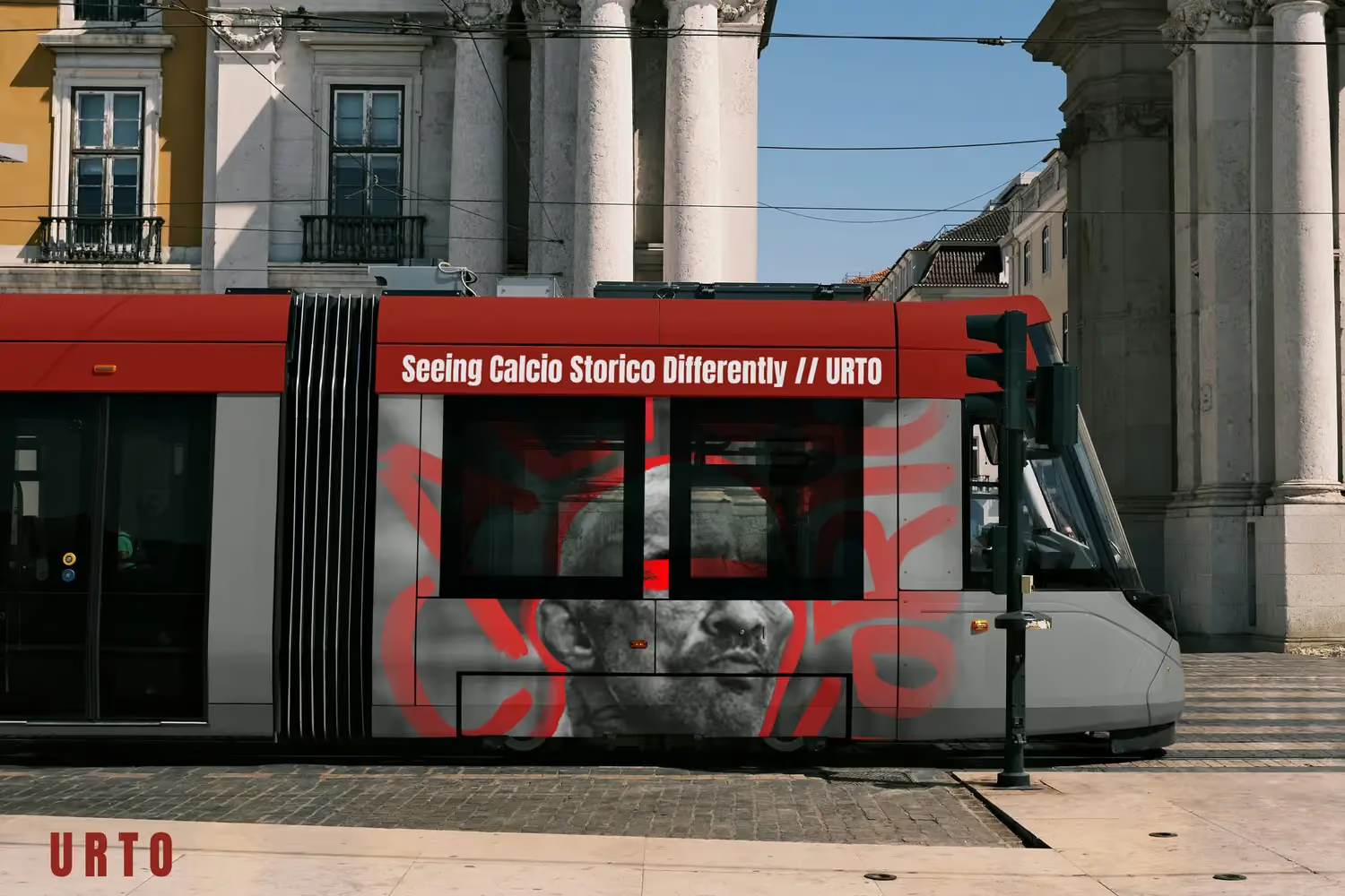
The system leaves the pitch: an editorial line, street media and match-day print, carried across the city.
An identity that says on the outside what happens on the pitch.

"The sport was never the problem. What surrounded it was, and nobody had decided any of it."